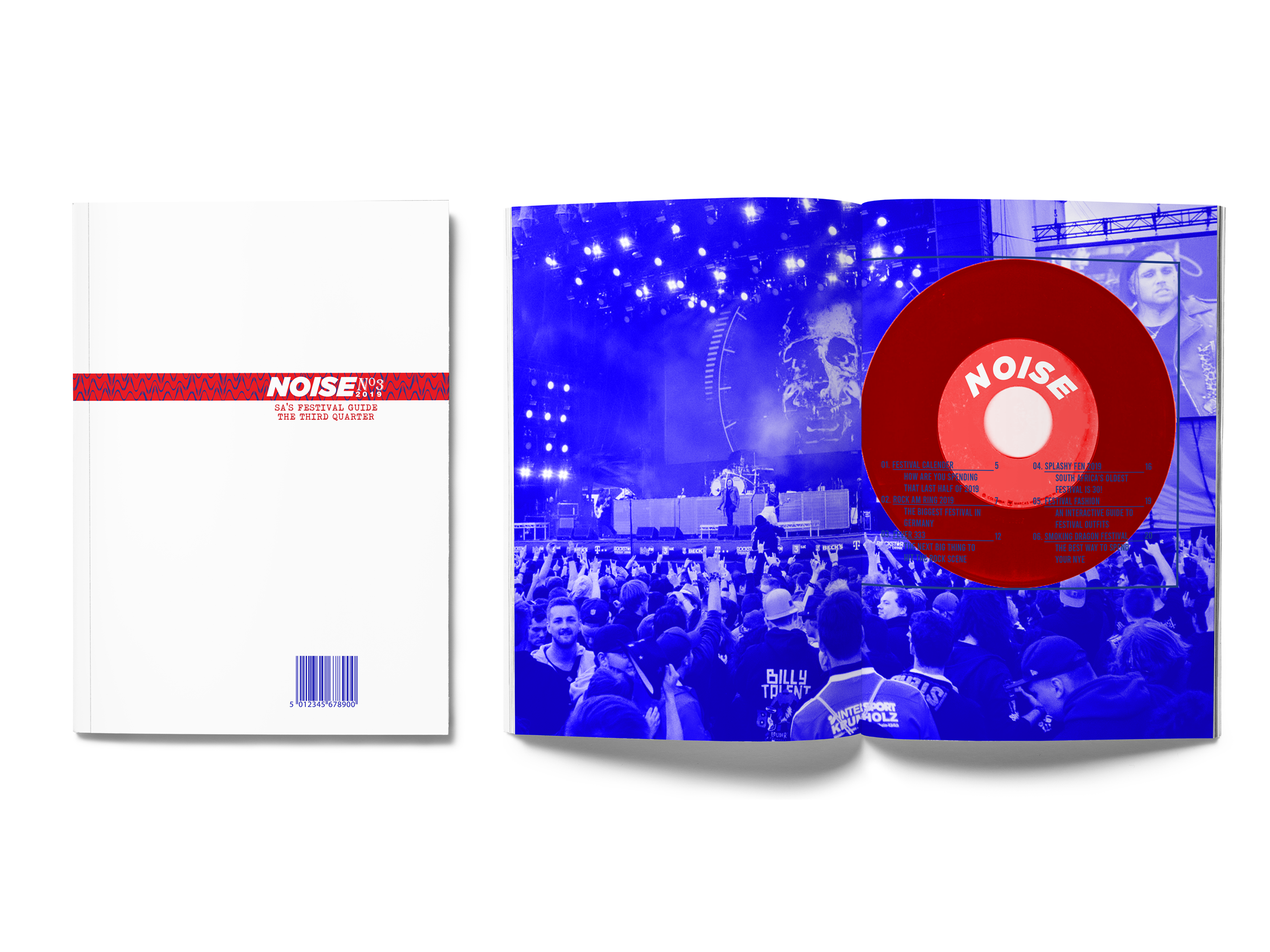
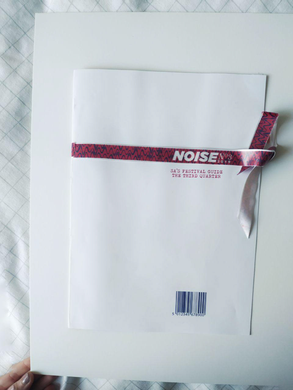
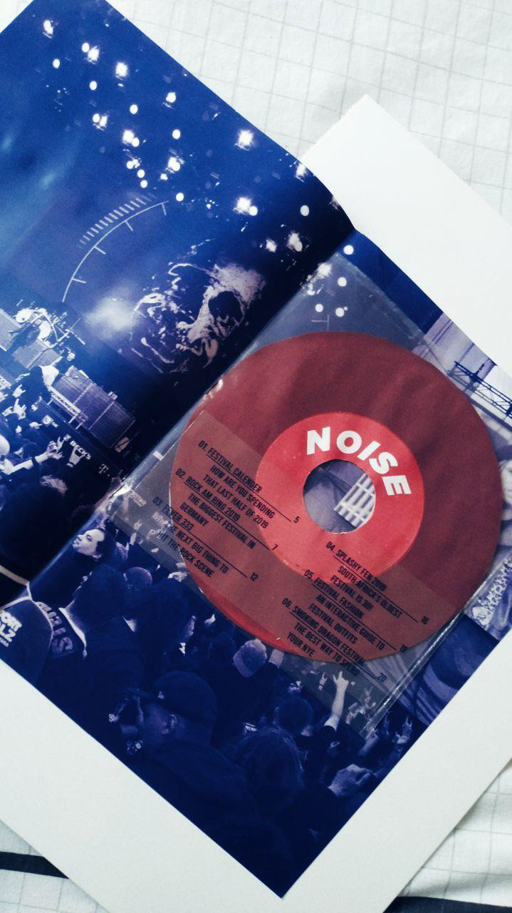
The cover was made plain in order to draw attention to the festival wristband that bound it. The contents page had a plastic sleeve insert which had a 11 inch vinyl in it with the contents printed on the front and the contributors on the back.
Gone are the days of hardcore music magazines that completely blur the lines of good design. The days of Raygun and Punk magazine. Noise is a magazine that brings back the creative layouts and differing typefaces in a cleaner way, without the use of black. Because white can be just as hardcore as black. Noise is a South African music festival guide with a few international entries. Almost all the photos were taken by me at the festivals and on film which adds the grainy texture you see, and most of the articles were also written by me. The few photos and articles that aren't by me have been credited in the magazine. The choice of blue and red as almost the only two colours is due to the cool effects that can be done with them such as in the Cage The Elephant spread. The magazine aims to be as interactive as possible by having pieces you can rip off, dolls to dress up, text that is legible only once a sheet is over it and a cover with a festival armband you have to take off.
Editorial design by Tamara Weetman.
Photography by Dario Mijulkov, Tamara Weetman and Trvn photography.
Articles by Russell Grant, Tamara Weetman, Splashy Fen and Rock am Ring.
Photography by Dario Mijulkov, Tamara Weetman and Trvn photography.
Articles by Russell Grant, Tamara Weetman, Splashy Fen and Rock am Ring.

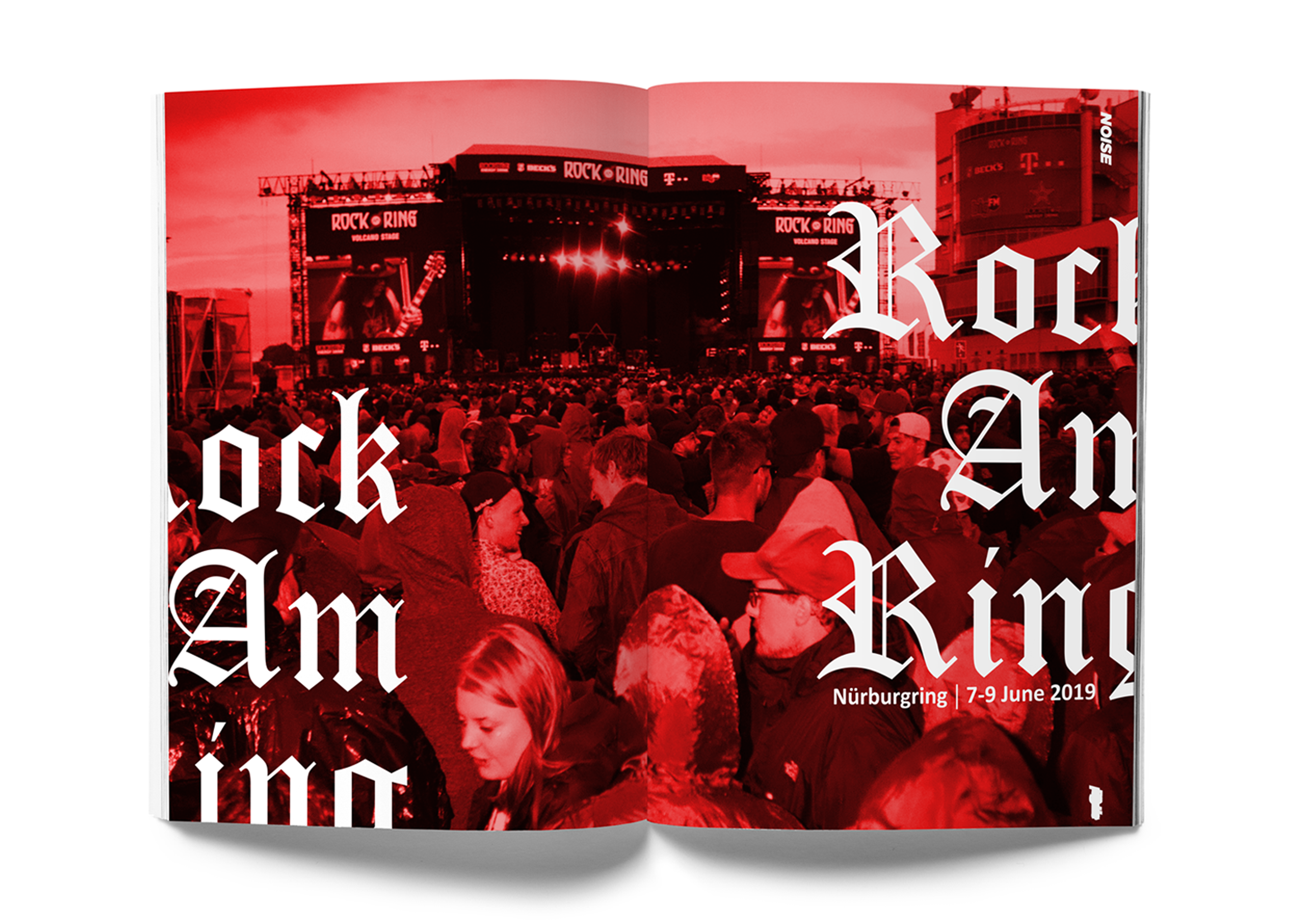
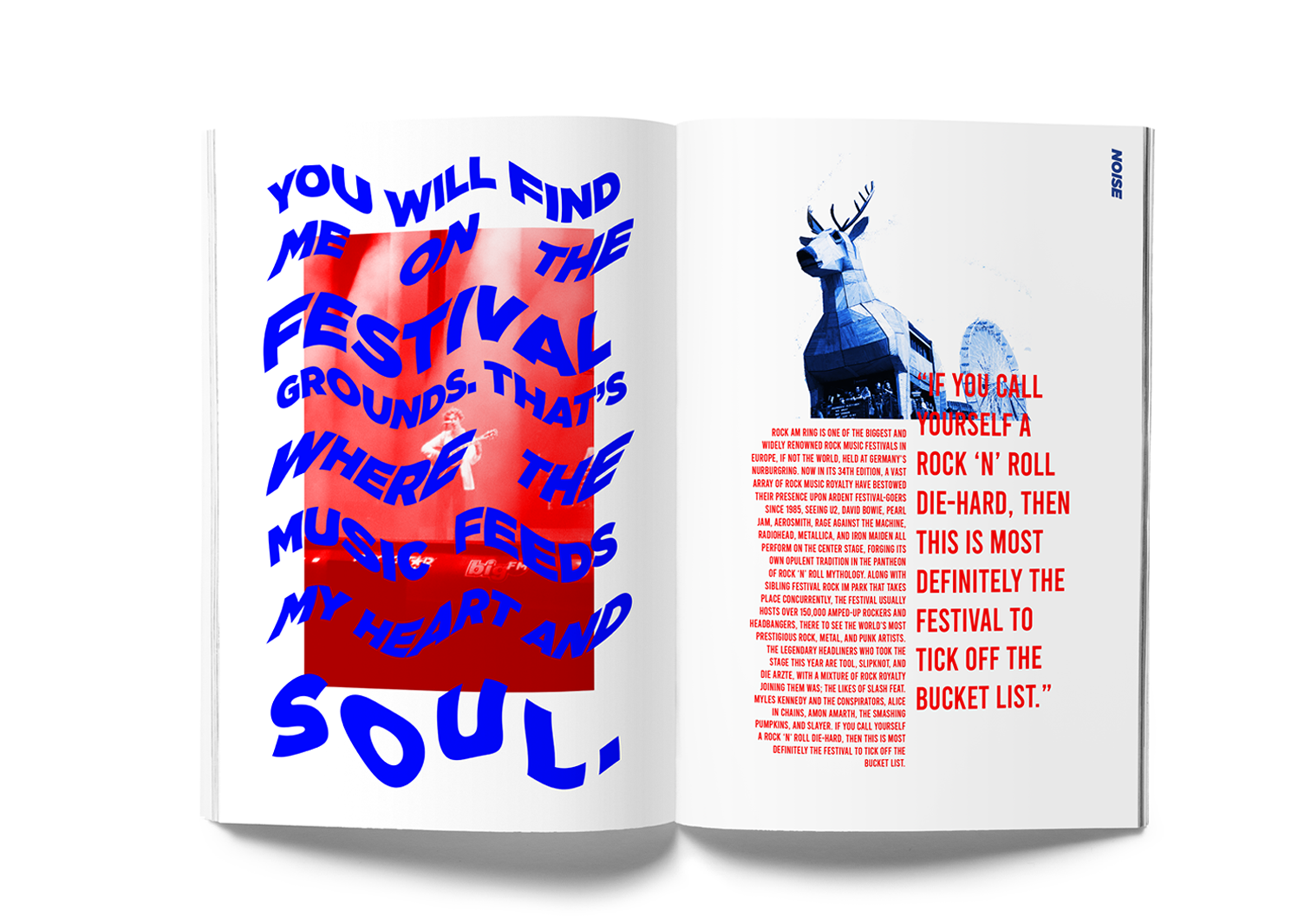
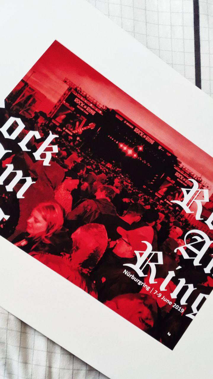
Rock Am Ring is a very hardcore festival and its spread had to reflect that in the text.

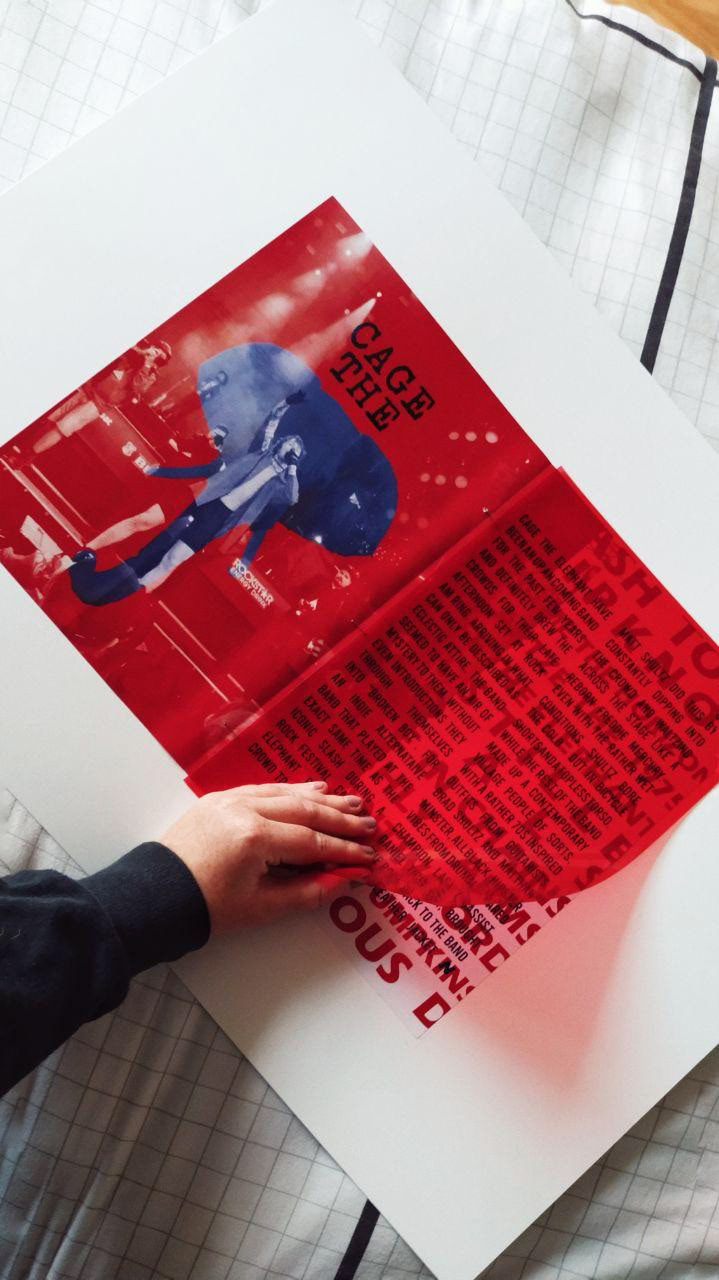
This spread can only really be understood in its physical form, but to get a better idea of how it works see the images at the end of the project. There is a red tinted plastic sheet that goes in the middle of this spread and when it covers the left page, the red is hidden and only the elephant is visible. When it covers the right page, the red disappears and makes the blue writing legible.
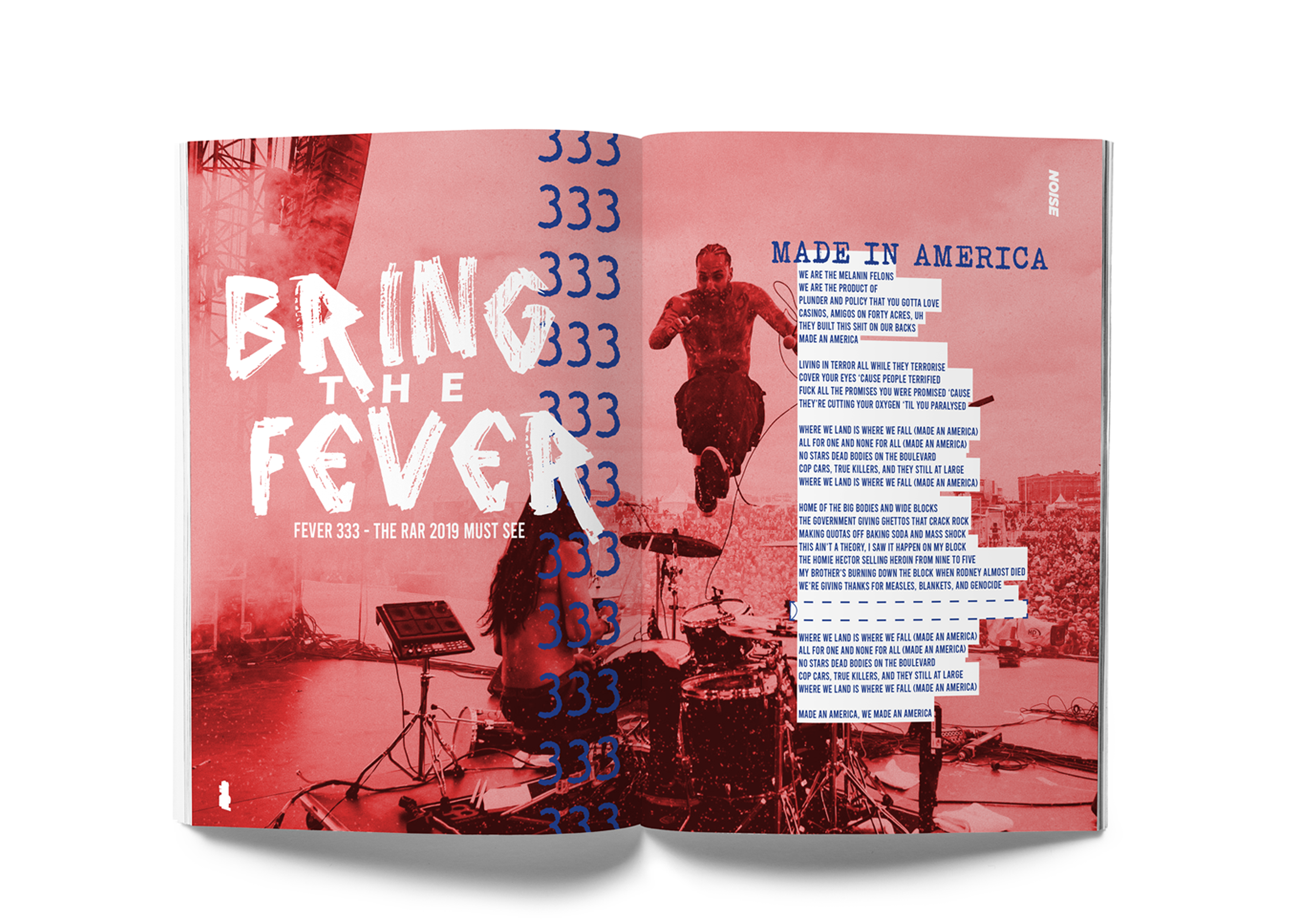
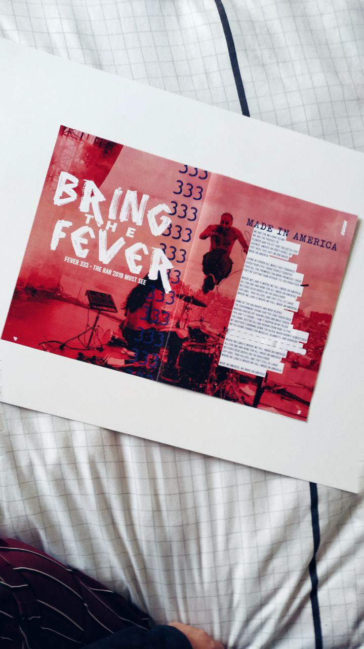
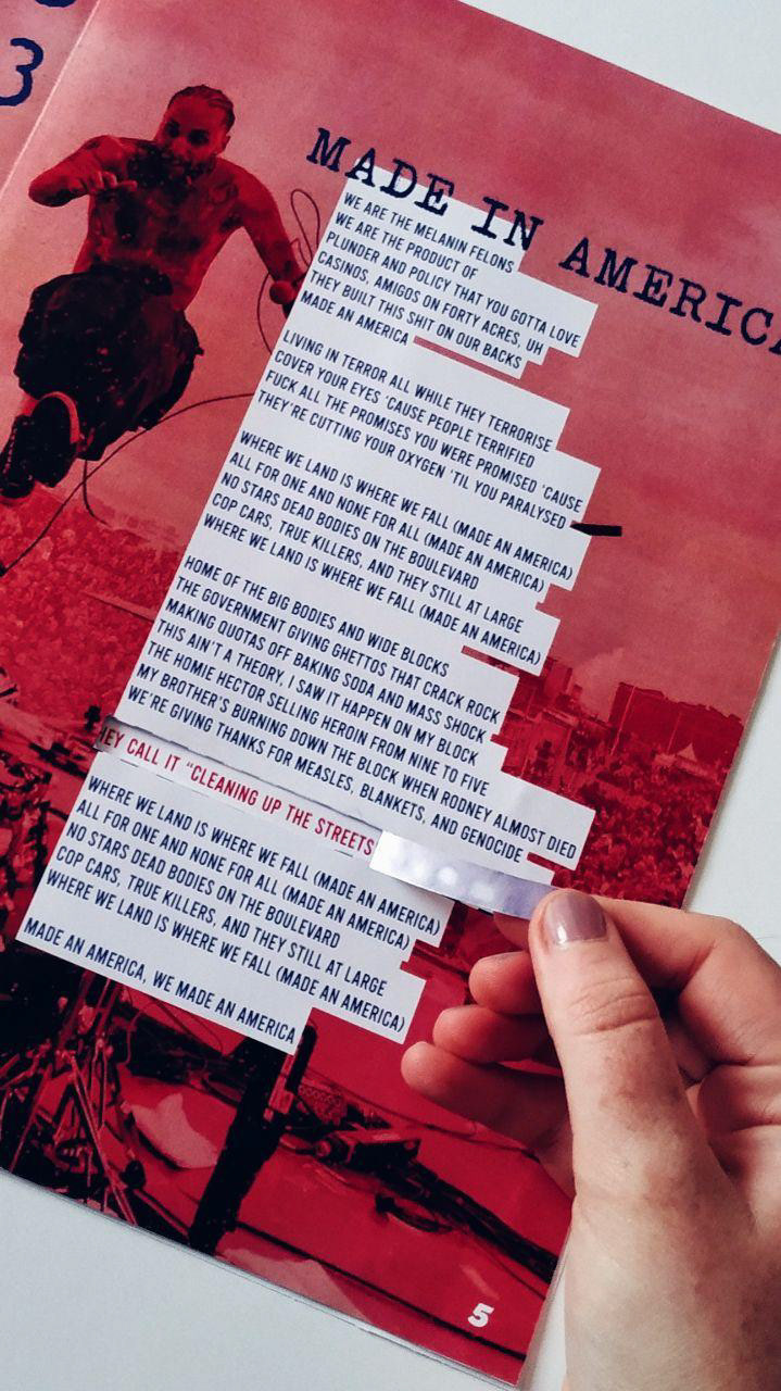
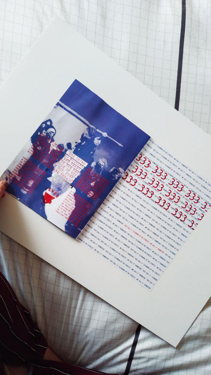
The Fever 333 spread is my favourite spread of the magazine. It had to do a lot of things because it had to show all sides of the band. The thrash side, the punk side and the hip-hop side. When they play a set the crowd always chants "333" on repeat hence the repetition on the left page. There is a perforated line that reveals a line on the next page.

The line that is torn through on the spread before meant there had to be a gap in the text on the left page in this spread. On the right side we see exactly where the tear-out would reveal the line due to its red colouring.

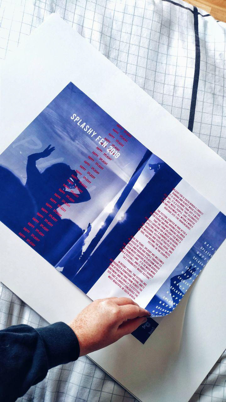
Splashy Fen is a completely different festival to RAR and deserved a different style. It is a very laid back festival where people come up to you and yell "Happy Splashy"
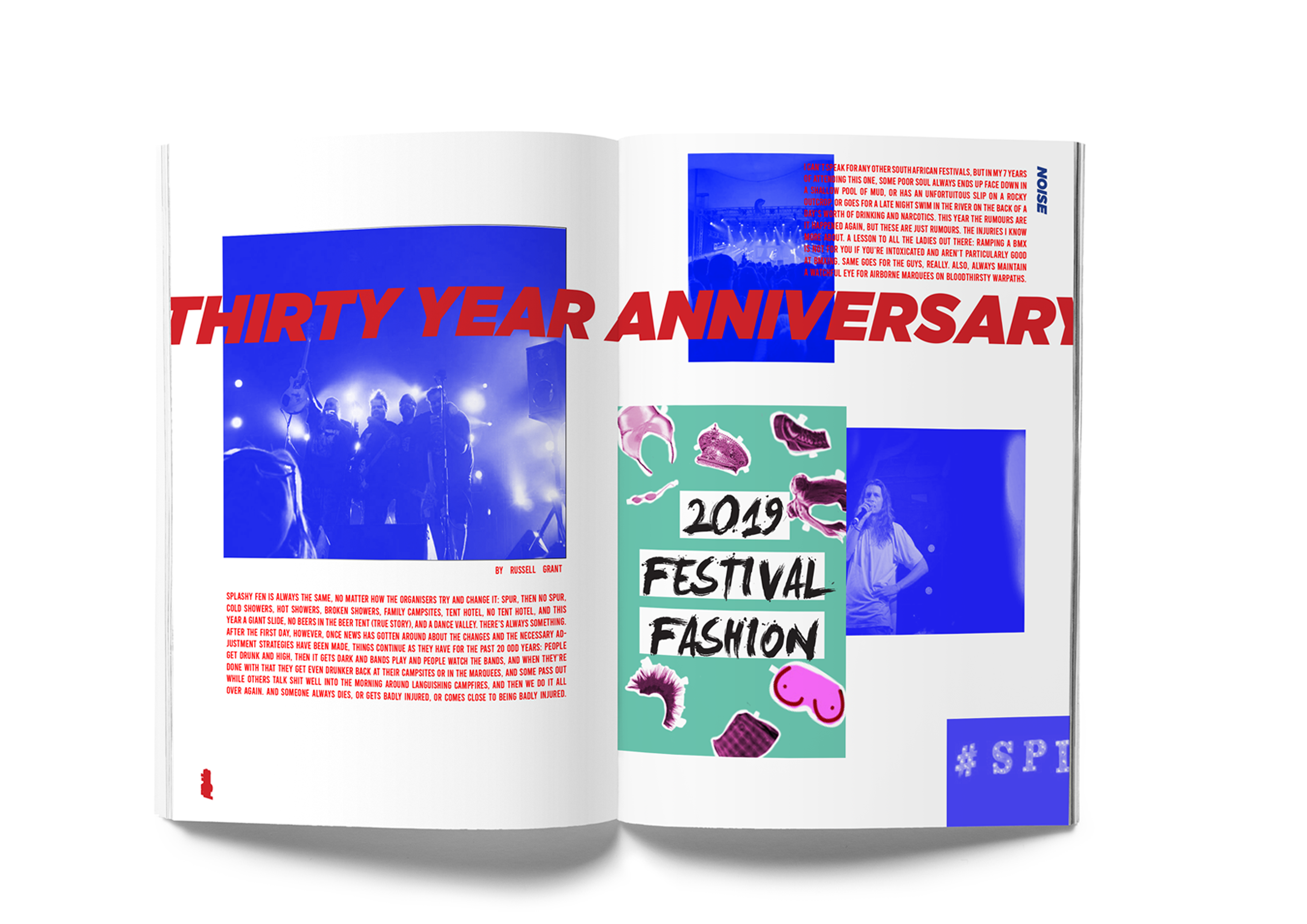
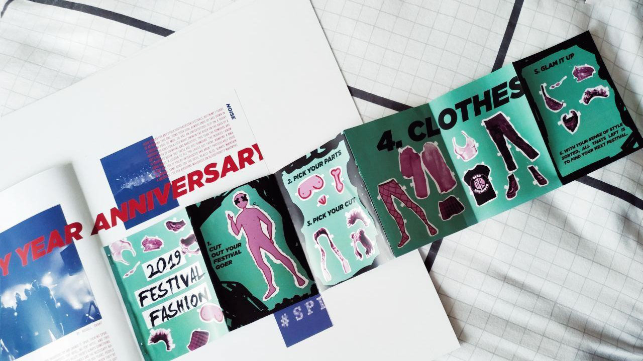
This is the only spread that deviates from the two colour scheme. This spread has a pull out-zine.
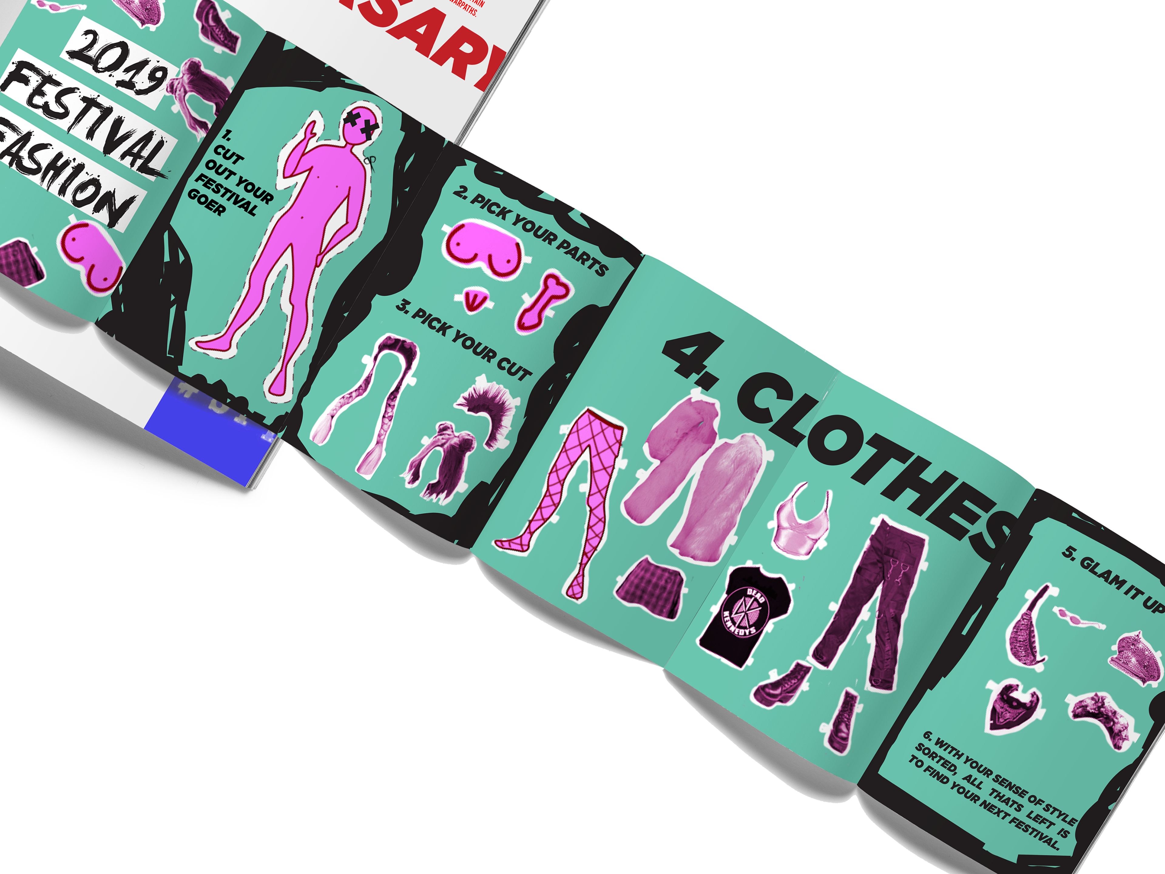
The Zine mimics retro cut out dolls however with a festival twist. The user may choose to be a punk or a glam festival goer, they can even choose their genitalia.

The last festival had only one spread because it not a very well known festival however the main focus had to be the wooden fire that is lit every year.

All the spreads next to each other shows that there is a similar stylistic treatment to the pages, even when there is no set typefaces for a magazine.

THANK YOU.